Innovative information visualization of electronic health record data
In a recent paper, Vivian L West, David Borland and W Ed Hammond investigated the use of visualization techniques reported between 1996 and 2013 and, in a systematic review, evaluated innovative approaches to information visualization of electronic health record (EHR) data for knowledge discovery.
The only embedded charts appear in the Historical Background chapter, and are related to the visualization of casualties during wars. I found them amazingly complex and modern.
A flow diagram by Charles Minard
The first is a figurative chart of the successive losses in men by the French army in the Russian campaign 1812–1813, published in 1869 by Charles Minard.
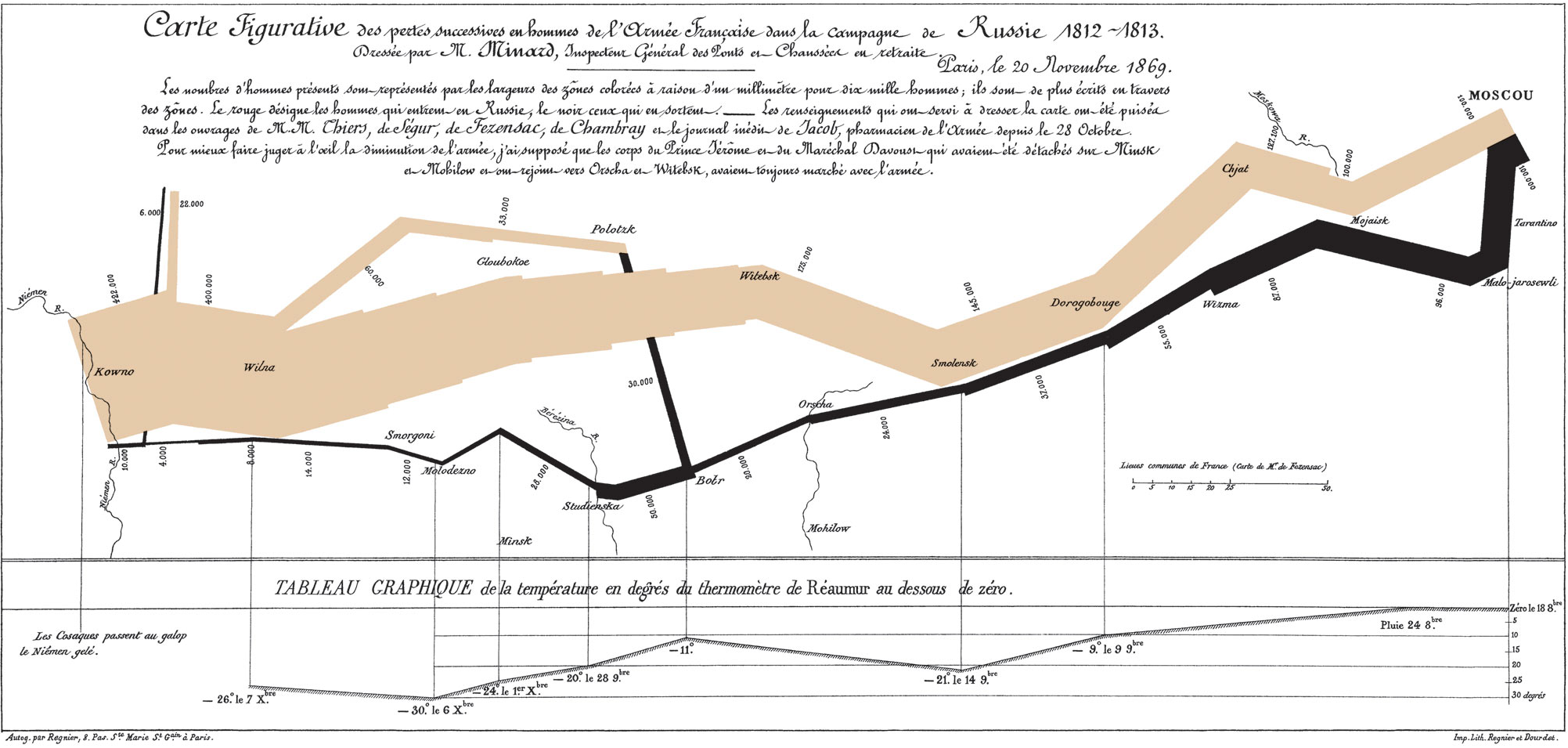
It looks like a curve, but actually draws a geographical path, naming towns and rivers. The brown (initially red) line represents the way from the Russian border to Moscow and the black line the way back. The broadness of the trait represents the number of men involved (1 mm for ten thousand men in the original document). It is clearly visible that few escaped.
This drawing by Minard is one of the most famous example of a specific type of flow diagram, now called Sankey diagrams, in which the width of the arrows is shown proportionally to the flow quantity.
Under the geographic path, a curve shows temperatures during the way back, expressed in Réaumur scale.
A polar area diagram by Florence Nightingale
The second example is the "Diagram of the causes of mortality in the army in the East" by Florence Nightingale.
Nightingale is described as a true pioneer in the graphical representation of statistics, and is credited with developing a form of the pie chart now known as the polar area diagram, or occasionally the Nightingale rose diagram.
This graphic was published in Notes on Matters Affecting the Health, Efficiency, and Hospital Administration of the British Army and sent to Queen Victoria in 1858. It indicates the number of deaths that occurred from preventable diseases (in blue), those that were the results of wounds (in red), and those due to other causes (in black).
