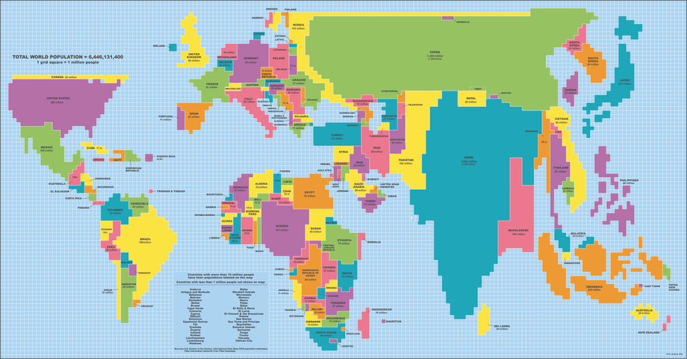
Map of the World Adjusted for the Population Size of Countries
Friday, August 23rd, 2013The map, from Gizmodo, uses 1 grid square to represent 1 million people. You can see how the map tries to stay true to a country’s original shape.
Some giant countries like Canada, Russia and Australia become tiny strips and dots while other giant countries like China and India predictably inflate and take over the map. Iceland and Belize didn’t even have enough people to show up.
